Juice design system
Lorem ipsum dolor sit amet, consectetur adipiscing elit. Suspendisse varius enim in eros elementum tristique. Duis cursus, mi quis viverra ornare, eros dolor interdum nulla, ut commodo diam libero vitae erat. Aenean faucibus nibh et justo cursus id rutrum lorem imperdiet. Nunc ut sem vitae risus tristique posuere.
Colors
Our primary brand colors are white and black. They are used to provide accessibility, simplicity, and consistency throughout all brand communications.
Background
Lorem ipsum dolor sit amet, consectetur adipiscing elit. Morbi ut varius lorem, vitae sodales eros. Mauris quis quam in diam cursus facilisis at quis odio. In rhoncus molestie felis.
Text
Lorem ipsum dolor sit amet, consectetur adipiscing elit. Morbi ut varius lorem, vitae sodales eros. Mauris quis quam in diam cursus facilisis at quis odio. In rhoncus molestie felis.
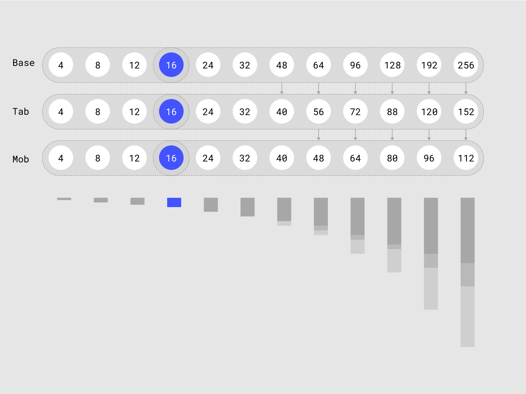
Spacing
Our primary brand colors are white and black. They are used to provide accessibility, simplicity, and consistency throughout all brand communications.
Vertical Spacing
Step of 4px
Margin class names
Margin bottom
Margin right
Padding
Paddings are developed depending on the design. But we do not use global classes, but only multi-classes, or we assign the padding value to a custom class
Typography
Font sizes can be different, in accordance with your style in design. But the baselines of the font shlould be lie on a 4-pt grid. To achieve this, you need to pay more attention to line hight than exact font sizes. Light height set in percent.
Heading's font size automatically changes starting from the Landscape Screen.
Desktop
Class name .heading and .text are the common global class name.
Headings can be used with class names:
Heading 1 - .heading.heading-2xl
Heading 2 - .heading.heading-xl
Heading 3 - .heading.heading-l
Heading 4 - .heading.heading-m
Heading 5 - .heading.heading-s
Heading 6 - .heading.heading-xs
Text class names system:
.text - standard class for all text elements
.text.text-s - small text
.text.text-l - large text
Heading 1 Bold 48
Heading 2 Bold 32
Heading 3 Bold 24
Heading 4 Bold 16
Heading 5 Bold 14
Heading 6 Bold 12
Body Regular 18
Body Regular 16
Note Bold 10
Block Quote
Mobile
Lorem ipsum dolor sit amet, consectetur adipiscing elit. Morbi ut varius lorem, vitae sodales eros. Mauris quis quam in diam cursus facilisis at quis odio. In rhoncus molestie felis.
Heading 1 Bold 32
Heading 2 Bold 24
Heading 3 Bold 18
Heading 4 Bold 16
Heading 5 Bold 14
Heading 6 Bold 12
Body Regular 16
Body Bold 14
Note Bold 10
Block Quote
Text style
.caps
.italic
.text-center
.text-right
.text-left
.tablet-text-left
.tablet-text-center
.landscape-text-left
.landscape-text-center
.portrait-text-left
.portrait-text-center
Font weight
.text-weight-100
.text-weight-200
.text-weight-300
.text-weight-400
.text-weight-500
.text-weight-600
.text-weight-700
.text-weight-800
.text-weight-900
What’s a Rich Text element?
The rich text element allows you to create and format headings, paragraphs, blockquotes, images, and video all in one place instead of having to add and format them individually. Just double-click and easily create content. Click here.
Static and dynamic content editing
A rich text element can be used with static or dynamic content. For static content, just drop it into any page and begin editing. For dynamic content, add a rich text field to any collection and then connect a rich text element to that field in the settings panel. Voila!
How to customize formatting for each rich text
- text
- text
Headings, paragraphs, blockquotes, figures, images, and figure captions can all be styled after a class is added to the rich text element using the "When inside of" nested selector system.
How to customize formatting for each rich text
Headings, paragraphs, blockquotes, figures, images, and figure captions can all be styled after a class is added to the rich text element using the "When inside of" nested selector system.
How to customize formatting for each rich text
Headings, paragraphs, blockquotes, figures, images, and figure captions can all be styled after a class is added to the rich text element using the "When inside of" nested selector system.
Headings, paragraphs, blockquotes, figures, images, and figure captions can all be styled after a class is added to the rich text element using the "When inside of" nested selector system.
Forms
All elements for the form must be in the main states
Normal state
Error state
Success state
Other
Set here the rest of the UI elements used in your design.
Tabs
For Developers
Here are collected all the rules and principles that are important for developers and which are not included in the general framework
Rules
Structure
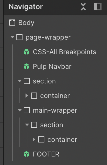
The page structure is shown in the image.
All elements must be wrapped in a .page-wrapper class. Inside it there are css properties, navbar, main-wrapper and footer.
- .navbar - tag "Navbar".
- .main-wrapper - has a tag name "Main" and contains all sections of the page (except the Hero Section).
- .section - tag "Section", padding right and padding left are 40px, position is Relative.
Hero Section has the same .section class name, should has a tag "Header" and only this section should contain Heading 1.
Classes that you can add as a combo-class to the .section:
.bg-color-[number]
.overflow-hidden
- .container -
width 100%,
margin left and right are auto,
padding top and bottom are 80px and
max-width 1180px.
Paddings and max-width can be changed depending on the design.
Container has one Heading 2 as a main title and subtitles Heading 3, 4, 5, 6. - .footer - has a tag "Footer".
Always save as a symbol:
- Navbar
- Footer
- Buttons
- CSS
Class names
Use the names of the classes & animations without abbreviations so that the client / other developer can immediately understand what this element / animation is doing in the project.
Class Names
- All classes must be written with a small letter separated by a dash.
- Never use webflow generated classes. Ex. Div Block 28, Heading… etc.
- Each element should have a class name.
- Avoid more than 3 classes on 1 element. Use custom classes or nesting of one element in another instead.
Remove unused Classes.
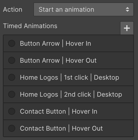
Animation Names
Use clear animation names
Common title | Trigger | Breakpoint (if this animation is different from the desktop one).
Common title can contain page name for better navigation among animations.
Remove unused animations.
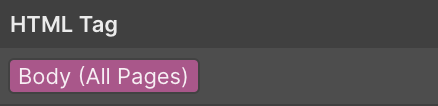
Fonts
- The main font should be connected to the Body (All pages).
- Use .woff2 font files.
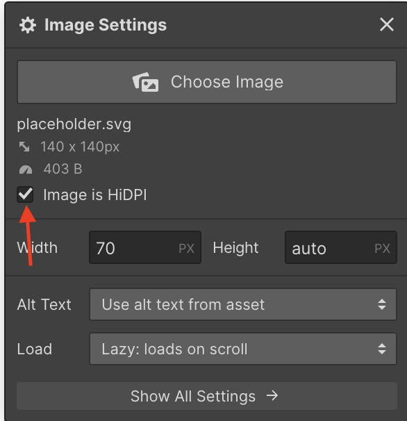
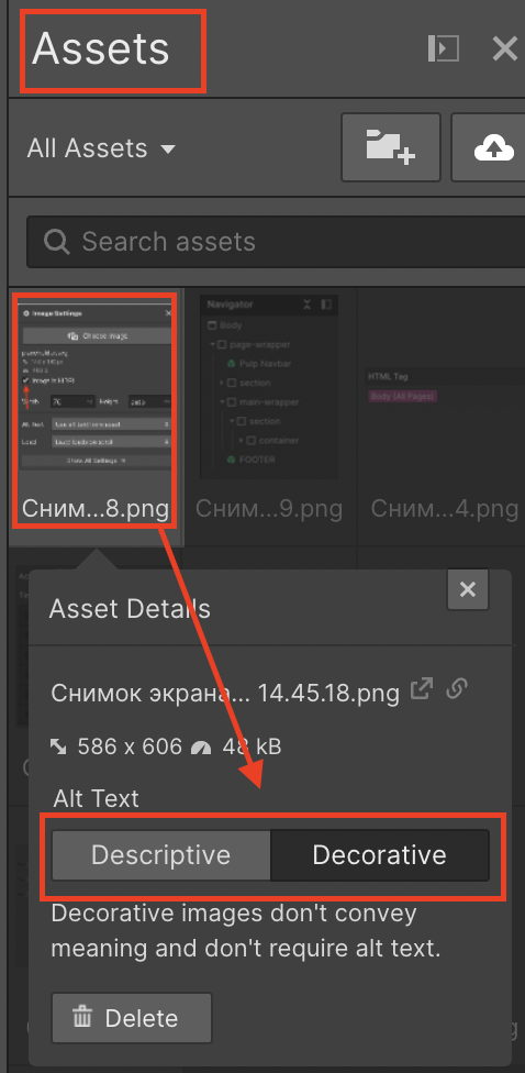
Images
- Type: svg and png.
- Weight: big images under 400kb with a high resolution.
- Use https://tinypng.com/ or https://www.imgonline.com.ua/compress-image.php to compress the images.
- Export from Figma as 2x and check checkbox "Image is HDPI".
- All images have to set alt tag from the Assets panel.
- All images have to set load as a "Lazy load on scroll".
Useful classes
Visibility control
Explanations
.visibility-hidden - use this class to the non-descriptive link content. For example, you can add a text "Find us on twitter" for the social link and add to this text .visibility-hidden class name.
